A few years ago, I took over optimization for a photography portfolio site that was, unsurprisingly,
experiencing severe performance issues. The homepage alone was transferring over 15 megabytes of
images—beautiful, high-resolution photographs served at full camera resolution regardless of display
size. Mobile users on cellular connections were waiting 30 seconds or more for the page to become
usable. The irony of a photographer’s website being unusable because of images wasn’t lost on
anyone.
That project taught me that image optimization isn’t about applying a single technique. It’s a
workflow: understanding formats, sizing correctly, compressing intelligently, serving responsively,
and loading strategically. Get all these pieces working together and you can reduce image weight by
70-80% without visible quality loss. Miss any of them and you’re leaving performance on the table.
This guide presents the complete image optimization workflow I’ve developed through years of working
on image-heavy sites. You’ll understand when to use WebP versus other formats, how to choose quality
settings that balance file size and visual fidelity, how responsive images actually work, and how
lazy loading fits into the picture. By the end, you’ll have a systematic approach to image
optimization that you can apply to any WordPress site.
Understanding Image Formats and When to Use Each
Format selection is the foundation of image optimization. The right format for one image might be
wrong for another, and choosing poorly can mean either bloated file sizes or unnecessary quality
loss.
The Legacy Formats: JPEG and PNG
JPEG has been the web’s standard photographic format since the 1990s. It uses lossy compression,
meaning it discards some image data during compression to achieve smaller files. The discarded data
is chosen to be visually insignificant in most cases—things human eyes don’t notice easily. For
photographs and complex images with gradual color transitions, JPEG provides good compression with
acceptable quality.
JPEG’s weakness is that it doesn’t support transparency, and repeated editing and saving compounds
quality loss. Each save introduces more compression artifacts. JPEG also struggles with sharp edges
and text, where its compression algorithms create visible blocky artifacts.
PNG uses lossless compression, preserving every pixel exactly as in the original. This makes PNG
ideal for graphics, logos, screenshots, and any image where precision matters. PNG also supports
transparency with full alpha channel control—not just “transparent or not” but varying levels of
transparency for smooth edges and shadows.
PNG’s weakness is file size. Because compression is lossless, PNG files are substantially larger than
JPEGs for photographic content. A photograph that might be 200KB as JPEG could be 2MB as PNG. Using
PNG for photographs is almost always a mistake from a performance perspective.
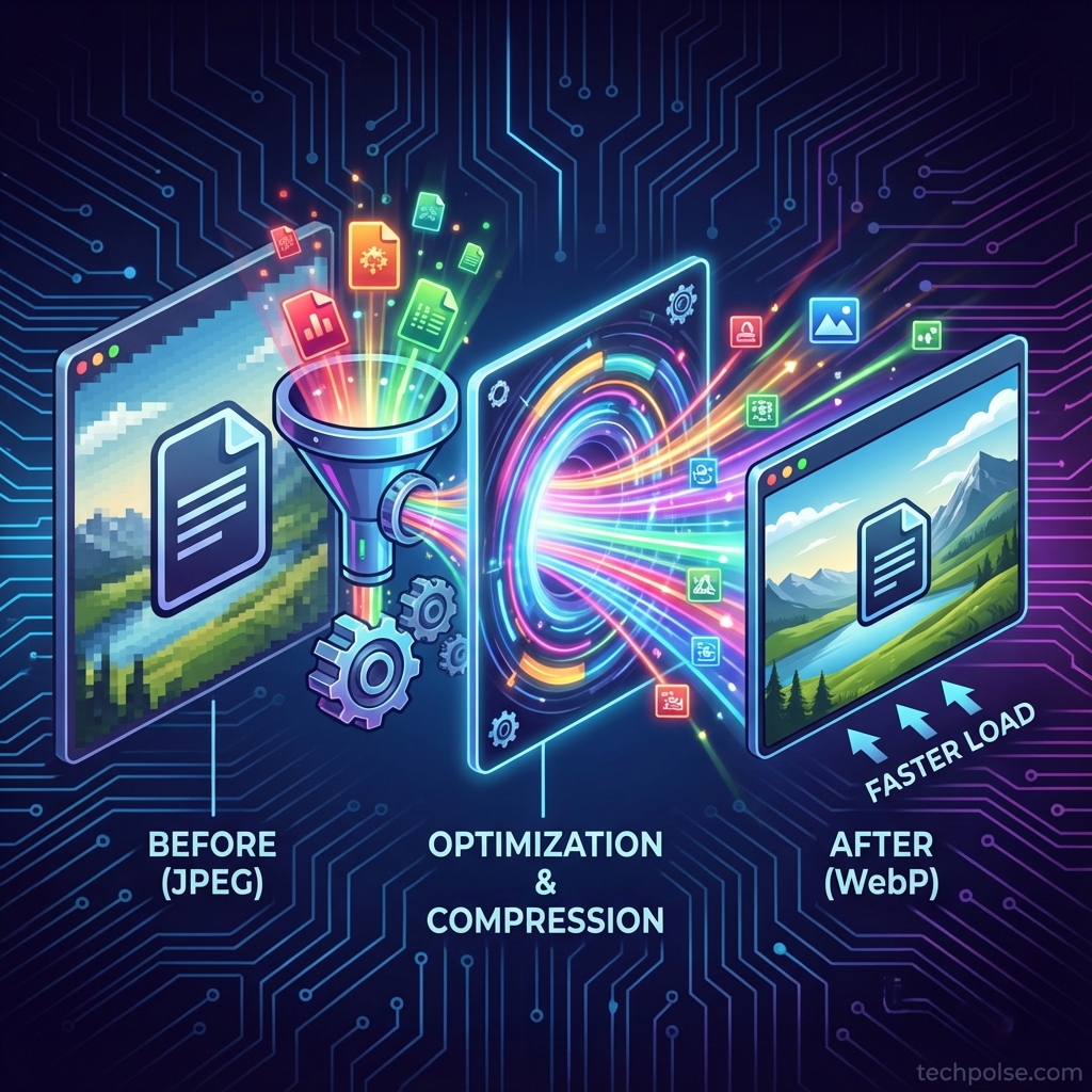
Modern Formats: WebP and AVIF
WebP, developed by Google, combines the best of both worlds. It supports both lossy compression (like
JPEG) and lossless compression (like PNG), plus transparency. And it typically achieves 25-35%
smaller file sizes than JPEG at equivalent quality, or 25-50% smaller than PNG for lossless content.
The improvement comes from more sophisticated compression algorithms. WebP uses techniques that
weren’t practical when JPEG was designed decades ago but work well on modern hardware. The visual
quality is essentially equivalent—compression artifacts are different in character but not worse.
WebP browser support is now universal among modern browsers. Chrome, Firefox, Safari, and Edge all
support it. The only holdouts are genuinely legacy browsers that represent a tiny fraction of
traffic. For most sites, serving WebP without fallbacks is perfectly reasonable.
AVIF is the newest contender, offering even better compression than WebP—typically 30-50% smaller at
equivalent quality. AVIF is derived from the AV1 video codec and represents state-of-the-art image
compression. The trade-off is slower encoding (converting images to AVIF takes longer) and browser
support that’s still catching up. Safari added AVIF support relatively recently, and some mobile
browsers lag behind.
For most WordPress sites today, WebP is the practical choice. It’s mature, universally supported, and
provides substantial improvement over JPEG/PNG. AVIF makes sense for high-volume sites where the
extra compression savings justify the slower encoding and more complex fallback handling.
Choosing the Right Format
My format selection process is straightforward. For photographs and realistic images, WebP with lossy
compression. For graphics with transparency (logos, icons, UI elements), WebP with lossless
compression. For already-small graphics without transparency that don’t benefit much from WebP,
sometimes staying with optimized PNG or even SVG makes sense.
The one format I never use on the web: BMP, TIFF, or other uncompressed/minimally compressed formats.
These should never reach your WordPress media library. If you see these formats in your library,
someone is uploading original camera files or design assets without any optimization.
Sizing Images Correctly Before Upload
One of the most common image optimization failures I see is ignoring dimensions. Sites upload
4000-pixel-wide photographs that display at 800 pixels. That’s 25 times more pixels than needed, and
even with good compression, you’re transferring far more data than necessary.
Understanding Display Dimensions
Every image on your website displays at specific dimensions determined by your design. Your content
column might be 720 pixels wide. Your featured images might display at 1200 pixels on large screens.
Thumbnails might be 300 pixels. Understanding these dimensions is essential for sizing images
correctly.
If your content column never exceeds 800 pixels wide, uploading a 4000-pixel-wide image provides no
benefit. The browser downloads all those pixels, then scales the image down for display. The extra
resolution is never seen—it only costs bandwidth and memory.
Accounting for High-DPI Displays
Modern devices complicate this slightly. Retina displays, common on phones and MacBooks, have device
pixel ratios of 2x or 3x. A 300-pixel-wide image slot on a Retina display actually uses 600 or 900
physical pixels. If you serve only 300 pixels, the image appears blurry.
The practical approach: size images at 2x your maximum display dimension. If an image displays at 800
pixels max, upload at 1600 pixels. This serves high-DPI displays well while remaining manageable for
standard displays. Going to 3x provides marginal improvement for the highest-DPI displays but
significantly increases file size—2x is usually the right trade-off.
Pre-Upload Resizing Workflow
Resize images before uploading to WordPress rather than relying entirely on WordPress to generate
sizes. This gives you control over the source image and reduces server processing during upload.
Desktop applications like Photoshop, GIMP, or lightweight alternatives like XnConvert or IrfanView
handle batch resizing efficiently. Set your maximum dimension (say, 2000 pixels on the long edge),
process your images, and upload the resized versions.
For cameras producing 6000+ pixel images, this pre-upload step is essentially mandatory. WordPress
will generate smaller sizes for responsive delivery, but starting from a 6000-pixel original means
storing unnecessary data and processing more than needed.
Compression Quality: Finding the Balance
Quality settings control the trade-off between file size and visual fidelity. Lower quality means
smaller files but potentially visible artifacts. Higher quality means larger files but preserved
detail. The art is finding the point where quality reduction becomes perceptible.
Understanding Quality Scales
Image quality is typically expressed as a percentage from 0 to 100, where 100 is maximum quality. But
these numbers don’t mean what you might intuitively expect. Quality 100 doesn’t mean “perfect”—it
means minimum compression. And quality 80 doesn’t mean “20% worse”—the relationship is non-linear.
The practical reality: quality differences between 90 and 100 are often imperceptible to most viewers
but can represent 30-50% file size difference. Quality differences between 70 and 90 are subtle but
potentially noticeable in side-by-side comparison. Below 60-70, artifacts become increasingly
visible depending on image content.
Quality Settings by Use Case
Based on extensive testing across different content types, here are the quality settings I recommend:
For hero images and featured photographs—the prominent images that visitors notice first—use quality
80-85. These images are viewed closely and represent your site visually. The slightly larger file
size is worth the ensured quality.
For in-content images that accompany text, quality 75-80 works well. These images support content but
aren’t scrutinized pixel-by-pixel. At typical viewing conditions, 75 and 85 are nearly
indistinguishable, but 75 produces noticeably smaller files.
For thumbnails and small images, quality 70-75 is appropriate. Small display sizes mask compression
artifacts. A thumbnail that looks fine at 70 might show artifacts if enlarged, but thumbnails aren’t
enlarged.
Background textures and decorative images can often go lower—60-70—especially if they’re deliberately
subtle or blurred. Compression artifacts in a soft background blur are essentially invisible.
Testing Your Quality Choices
The right quality setting depends on image content and display conditions. To find optimal settings
for your specific images, try this approach: save the same image at quality 100, 85, 75, and 65.
View them at actual display size in a browser—not zoomed in, not in an image editor, but as visitors
actually see them. Can you spot the difference?
For most photographic content, 75 vs 85 is hard to distinguish at typical viewing distances. If you
genuinely can’t see a difference, use the lower setting. You’re not sacrificing quality that
visitors will notice, and you’re reducing file sizes and improving load times.
WordPress Image Handling and Optimization Plugins
WordPress automatically generates multiple sizes when you upload images and handles responsive image
markup. Understanding and configuring this system—plus adding optimization plugins—creates an
efficient image workflow.
Default WordPress Image Sizes
WordPress generates several sizes when you upload an image: thumbnail (typically 150×150), medium
(max 300 wide), medium_large (max 768 wide), and large (max 1024 wide), plus the original full size.
These sizes power the srcset responsive image system.
You can adjust these defaults in Settings > Media, though changing them after uploading images
requires regenerating existing thumbnails. Your theme might also register additional sizes for
specific design purposes like featured image crops or grid layouts.
The key is matching these sizes to your actual design needs. If your content column is 700 pixels
wide, having a “large” size at 1024 pixels provides good coverage. But if your hero images display
at 1400 pixels, you might need a custom larger size.
Image Optimization Plugin Selection
WordPress doesn’t optimize or compress images by default—it just resizes them. Optimization plugins
fill this gap by compressing uploads, converting to WebP, and managing quality settings.
ShortPixel is my current recommendation for most sites. It offers lossy, glossy (moderate lossy), and
lossless compression options, generates WebP versions automatically, and works through a cloud-based
API that offloads processing from your server. The free tier provides 100 image credits
monthly—enough for low-volume sites. Paid plans are affordable for larger image needs.
Imagify provides similar functionality with slightly different pricing. It integrates particularly
well with WP Rocket if you’re using that caching plugin. The visual comparison tools make it easy to
verify compression quality.
EWWW Image Optimizer can optionally process images locally on your server (no cloud API required),
which appeals to privacy-conscious users or those with server resources to spare. Local processing
is slower but keeps images on your infrastructure.
Plugin Configuration Best Practices
When configuring optimization plugins, several settings matter:
Enable lossy compression. The size savings are substantial and quality loss is not perceptible with
good algorithms. Lossless optimization provides much smaller improvements.
Enable WebP conversion for all images. This generates WebP versions alongside your original formats,
letting you serve modern formats to supporting browsers.
Keep original backups initially. If you later decide to adjust quality settings, original files let
you reprocess without re-uploading. Once you’re confident in your settings, you can disable backups
to save storage.
Enable auto-resize to cap maximum dimensions. If someone uploads a 5000-pixel image, the plugin
resizes it before processing, preventing unnecessarily large files from ever entering your library.
Run bulk optimization on your existing library. New uploads get optimized automatically, but existing
images need a one-time processing run.
Serving WebP Images
Generating WebP files is only half the solution—you need to actually serve them to browsers. There
are several approaches.
Picture element replacement rewrites your img tags to picture elements with WebP sources and original
format fallbacks. Most optimization plugins can do this via output buffering or content filters.
It’s the most compatible approach.
Server-level rewriting uses Apache or Nginx configuration to serve WebP when the browser supports it
(detected via Accept headers) and the WebP version exists. This is more efficient than PHP-level
replacement but requires server configuration access.
CDN-level conversion services like Cloudflare’s Polish can convert images to WebP on-the-fly at the
edge. This offloads conversion from your server but depends on your CDN provider’s features.
Responsive Images: Serving the Right Size
Responsive images ensure visitors receive appropriately sized images for their device. A phone with a
400-pixel-wide screen shouldn’t download a 2000-pixel image—it wastes bandwidth and provides no
visual benefit.
How srcset Works
The srcset attribute lists available image versions with their widths. The sizes attribute tells the
browser how wide the image will display at various viewport widths. The browser combines this
information with its knowledge of the viewport and device pixel ratio to select the optimal image.
For example, if your image displays at full viewport width on mobile but 50% viewport width on
desktop, the sizes attribute communicates that. The browser then selects from srcset
accordingly—maybe the 400-pixel version for a phone, the 800-pixel version for a tablet, and the
1200-pixel version for a desktop.
WordPress generates srcset automatically for images inserted through the editor. The system uses the
sizes WordPress generates (thumbnail, medium, etc.) as the srcset options. This works reasonably
well by default, especially if your registered image dimensions align with your design.
Optimizing sizes Attribute
The default sizes attribute WordPress generates is often suboptimal. It typically says something like
“(max-width: 1024px) 100vw, 1024px”—meaning the image takes 100% viewport width up to 1024 pixels,
then stays at 1024 pixels. This is often not accurate to actual layout behavior.
If your content column is 720 pixels wide at desktop sizes, the image never displays at 100% viewport
width on large screens. More accurate sizes might be “(max-width: 720px) 100vw, 720px”—on narrow
viewports the image is viewport width, but it never exceeds 720 pixels.
Getting sizes right helps browsers make better decisions. Inaccurate sizes might cause over-selection
(loading larger images than needed) or under-selection (loading smaller images that appear blurry).
Some themes and page builders override the default sizes calculation with context-aware values.
Others provide hooks or filters for customization. Optimizing this is somewhat technical but can
meaningfully improve responsive image selection.
Art Direction with Picture Element
Sometimes you need more control than srcset provides. Art direction means serving different crops or
entirely different images for different viewports—not just different sizes of the same image.
A landscape hero image might work well on desktop but should be cropped tighter for portrait phone
displays. A complex infographic might need a simplified mobile version. The picture element with
multiple source elements enables this, specifying different images for different media queries.
This level of control requires manual implementation or specialized plugins/themes. It’s beyond what
WordPress provides automatically but valuable for key visual moments where adaptation improves the
mobile experience.
Lazy Loading: Deferring What’s Not Yet Needed
Lazy loading delays image loading until images approach the visible viewport. For long pages with
many images, this significantly reduces initial page load—visitors don’t wait for images they might
never scroll to see.
Native Browser Lazy Loading
Since 2019-2020, browsers have supported native lazy loading via the loading=”lazy” attribute. No
JavaScript required—the browser handles everything. When applied, images outside the viewport don’t
load until the user scrolls close to them.
WordPress 5.5 and later automatically adds loading=”lazy” to images inserted via the editor. This
provides good default behavior for most content images.
Native lazy loading is efficient and reliable, but you don’t have control over the threshold—how far
ahead the browser starts loading. Browsers generally load conservatively to prevent users from
seeing loading placeholders during normal scrolling.
Critical Exception: Above-Fold Images
Lazy loading images visible without scrolling (above the fold) hurts performance rather than helping.
The browser delays loading the LCP image, slowing down the perceived render time.
The solution is ensuring hero images, featured images, and other immediately visible images load
eagerly. Use loading=”eager” or omit the loading attribute entirely for these images. WordPress
tries to detect the first content image and skip lazy loading for it, but this detection isn’t
always accurate, especially for custom templates.
For featured images in article templates, explicitly set eager loading either in theme code or via
plugin configuration.
Placeholder Strategies
Before lazy-loaded images load, visitors see either blank space (if dimensions are set) or layout
shift (if dimensions aren’t set). Some sites use placeholder techniques for better visual
experience.
Low-quality image placeholders (LQIP) load tiny, heavily blurred versions first, then replace with
full images. This gives an impression of the image immediately while full quality loads.
Implementation adds complexity but improves perceived performance for image-heavy sites.
Solid color placeholders based on dominant image color provide visual continuity without the
complexity of generating LQIP images. Services and plugins can extract dominant colors during upload
and use them for placeholder backgrounds.
For most sites, proper dimension reservation (width and height attributes or CSS aspect-ratio)
without visible placeholders is sufficient. Users scrolling through content don’t notice brief
loading moments if layout remains stable.
CDN and Caching Considerations
Image delivery optimization extends beyond the images themselves to how they’re served to visitors.
CDN Benefits for Images
CDNs provide two benefits for images: geographic distribution (cached copies at edge servers near
visitors) and offloading from your origin server. A visitor in Asia loading images from an Asian CDN
edge server experiences lower latency than loading from a European origin server.
Configure your CDN to cache images with long TTLs (a year is common). Image files rarely change once
uploaded, and when they do, the file URL typically changes anyway. Long caching maximizes cache hit
rates.
Image Transformation CDNs
Specialized CDNs like Cloudinary, imgix, or BunnyCDN’s optimization features can transform images on
the fly: resizing, changing format, adjusting quality. You upload original images and request
specific transformations via URL parameters.
These services simplify responsive images (request any size you need via URL), automate WebP delivery
(request the best format for each browser), and handle optimization without WordPress plugins. The
trade-off is cost—these are premium services—and vendor dependency.
For large sites with complex image needs, these services can be transformative. For smaller sites,
WordPress plugins provide similar results at lower cost.
Browser Caching for Images
Ensure your server or CDN sends appropriate Cache-Control headers for images. max-age=31536000 (one
year) with immutable is appropriate for images served from hashed or versioned URLs. Browsers store
these locally and don’t revalidate until the cache expires.
This matters for returning visitors and for users navigating between pages that share images (logos,
icons, cached referenced images). Properly cached images load instantly from local storage.
Measuring Image Optimization Results
After implementing optimization, measure the results to verify improvements and identify remaining
issues.
Page Weight Analysis
Browser DevTools’ Network panel shows exactly what’s loading. Filter by image type to see total image
weight for the page. Compare before and after optimization to quantify improvement.
A well-optimized article page might have total image weight of 200-400KB. If you’re seeing 2MB+ of
images on typical pages, there’s room for improvement. The specific target depends on your
content—image-heavy portfolios legitimately use more image bandwidth than text-focused articles.
Core Web Vitals Impact
Image optimization directly affects Largest Contentful Paint when your LCP element is an image
(common for articles with featured images). Optimizing LCP image size and loading behavior is often
the highest-impact performance improvement available.
Cumulative Layout Shift improves when images have explicit dimensions, preventing shifts as images
load. Check that width and height attributes or CSS dimensions are present on all images.
PageSpeed Insights specifically calls out image optimization opportunities: “Serve images in next-gen
formats,” “Properly size images,” “Defer offscreen images.” Zero warnings in these categories
indicates good image optimization.
Format Verification
Verify WebP is actually being served. In DevTools Network panel, check the Content-Type header for
image requests—it should be “image/webp” for supporting browsers. If you still see “image/jpeg” or
“image/png,” your WebP delivery isn’t configured correctly.
Test in different browsers to verify fallbacks work for any edge cases. Safari historically lagged on
WebP support, so testing there validates broad compatibility.
Common Optimization Mistakes
Through years of auditing sites, I’ve seen certain mistakes repeatedly. Avoiding these common
pitfalls improves outcomes.
Over-compression produces visible artifacts that hurt professional appearance. If you can see blocky,
washed-out, or blurry areas in your images, compression is too aggressive. Find the threshold where
artifacts become visible, then back off slightly.
Ignoring dimensions wastes bandwidth spectacularly. A single 5000-pixel image where 1000 pixels would
suffice transfers 25 times the necessary data. This single mistake often outweighs all other
optimization efforts combined.
Lazy loading hero images hurts LCP. Your main above-fold image needs to load immediately, not wait
for scroll proximity. Explicitly set eager loading for critical images.
Missing alt text isn’t a performance issue but is an optimization failure—accessibility and SEO both
depend on descriptive alt attributes. Include alt text on all meaningful images.
Not testing fallbacks can leave some visitors with broken images. If serving WebP via server rules or
JavaScript replacement, verify that non-WebP browsers still see images correctly.
Optimizing once and forgetting means new uploads gradually degrade site performance. Ensure
optimization plugins are configured to process new uploads automatically, and periodically audit
image weights to catch drift.
Conclusion
Effective image optimization is a workflow, not a single action. Start with proper sizing—upload
images at appropriate dimensions for your design, typically 2x display size for retina support. Use
WebP as your primary format for the substantial file size benefits over JPEG and PNG. Set
compression quality based on image prominence and viewing conditions, typically 75-85 for most web
use.
Let WordPress handle responsive image generation through srcset, but verify that your registered
sizes and sizes attributes align with your actual design. Apply lazy loading to defer below-fold
images while ensuring above-fold images load eagerly. Use optimization plugins to automate
compression and WebP conversion for all uploads.
Measure results through DevTools, PageSpeed Insights, and Core Web Vitals to verify improvements. A
well-optimized image workflow can reduce image weight by 70-80% without visible quality loss—a
substantial contribution to overall page performance.
Images don’t have to be a performance burden. With the right workflow, they become assets that
enhance your content while loading quickly and efficiently for every visitor.
admin
Tech enthusiast and content creator.