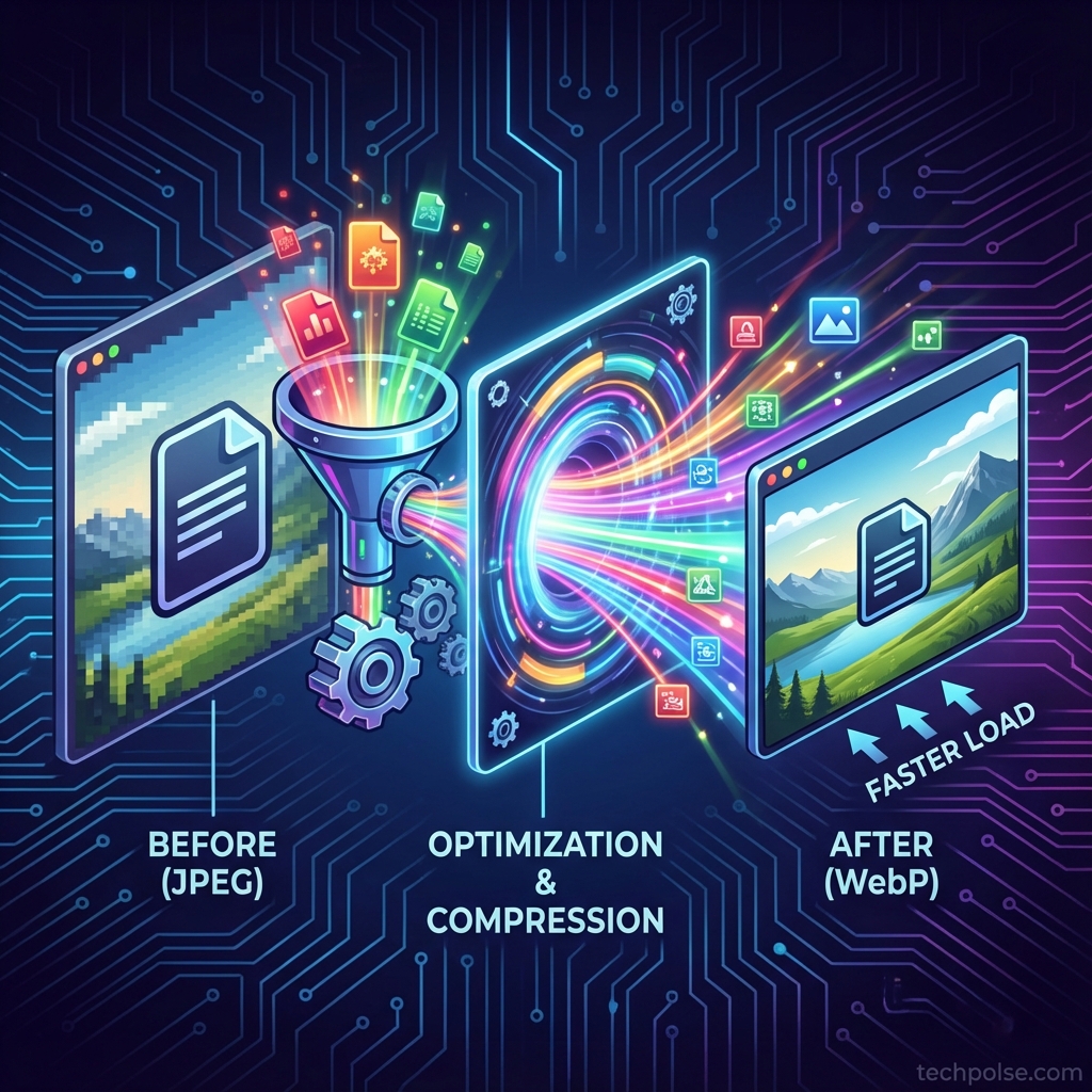
Images typically account for more than half of a web page's total size. Without proper optimization, even fast servers and clean code cannot overcome the weight of uncompressed photographs and graphics. WebP format offers substantial file size reductions compared to JPEG and PNG, but implementing it correctly requires more than simply converting files. This guide presents a complete image optimization workflow covering format selection, quality settings, responsive images, and lazy loading.
- WebP typically reduces file sizes by 25-35% compared to equivalent-quality JPEG
- Quality settings between 75-85% provide optimal balance for web images
- Responsive images with srcset reduce unnecessary data transfer for smaller screens
- Lazy loading defers off-screen images until they are needed
I. Understanding Image Formats
Choosing the right format for each image type is the foundation of optimization. Each format has specific strengths.
A. Format Comparison
- JPEG: Best for photographs and complex images with many colors. Lossy compression loses some detail but achieves significant size reduction.
- PNG: Best for graphics, logos, and images requiring transparency. Lossless compression preserves exact pixel data but creates larger files.
- WebP: Google's modern format supporting both lossy and lossless compression with transparency. Better compression than both JPEG and PNG in most cases.
- AVIF: Next-generation format with even better compression than WebP. Browser support is growing but not yet universal.
B. When to Use WebP
- Photographs: WebP lossy mode outperforms JPEG while maintaining visual quality.
- Graphics with transparency: WebP supports alpha channels like PNG but with smaller file sizes.
- Animated images: WebP supports animation as a lighter alternative to GIF.
- Browser support: All modern browsers support WebP. Provide JPEG or PNG fallbacks only for legacy systems if needed.
II. Pre-Upload Optimization
Optimal workflow includes optimization before uploading to WordPress. This reduces processing load and ensures control over quality settings.
A. Sizing Images Correctly
- Know your display size: If your content area is 800px wide, uploading 4000px images wastes bandwidth. Size to maximum display dimensions.
- Consider retina displays: For sharp images on high-DPI screens, upload at 2x your display size. 1600px for 800px display areas.
- Resize before upload: Desktop applications handle resizing more efficiently than WordPress. Batch resize in Photoshop, GIMP, or dedicated tools.
B. Quality Level Selection
Quality settings balance file size against visual fidelity. Lower quality means smaller files but more visible artifacts.
- Hero images and featured photos: Use 80-85% quality for prominent images where quality matters most.
- In-content images: 75-80% quality is usually indistinguishable from higher settings at typical viewing distances.
- Thumbnails and small images: 70-75% quality works well for images displayed at small sizes.
- Testing methodology: Compare 80% quality against 100% at actual display size. If you cannot see the difference, use 80%.
C. Metadata Removal
- EXIF data: Camera settings, GPS coordinates, and other metadata add file weight with no visual benefit.
- Color profiles: Embedded ICC profiles add bytes. Most web images work fine with sRGB without embedded profiles.
- Privacy consideration: Removing GPS data prevents accidental location disclosure from photographs.
III. WordPress Image Optimization Plugins
Plugins automate optimization on upload, ensuring all media library images are processed consistently.
A. Plugin Recommendations
- ShortPixel: Offers lossy, glossy, and lossless compression. WebP conversion included. Free tier provides 100 images per month.
- Imagify: Similar feature set with tiered pricing. Integrates well with WP Rocket for page cache coordination.
- Smush: Free version lacks WebP conversion but provides decent baseline optimization.
B. Plugin Configuration
- Compression level: Enable lossy compression for maximum size reduction. The visual difference is typically imperceptible.
- WebP conversion: Enable automatic WebP generation for all uploads.
- Original backup: Keep original files in case you need to reprocess with different settings later.
- Auto-resize: Enable to automatically resize images larger than your maximum needed dimensions.
- Bulk optimization: Run on existing media library after initial configuration.
C. WebP Delivery Methods
- Picture element: HTML5 picture element with WebP source and fallback. Most compatible approach.
- Content negotiation: Server delivers WebP when browser sends Accept header indicating support. Requires server configuration.
- JavaScript replacement: Script replaces image sources based on feature detection. Adds complexity and slight delay.
IV. Responsive Images Implementation
Responsive images serve appropriately sized files based on device screen size, avoiding wasted bandwidth on small screens.
A. Understanding srcset and sizes
- srcset attribute: Lists available image files with their widths. Browser selects the most appropriate size.
- sizes attribute: Tells browser how large the image will display at various viewport widths.
- WordPress default: WordPress automatically generates multiple sizes and adds srcset to images inserted via the editor.
B. Customizing Generated Sizes
- Default sizes: WordPress creates thumbnail, medium, medium_large, large, and full sizes. Review and adjust in Settings > Media.
- Theme-specific sizes: Well-coded themes register custom sizes matching their design. Check theme documentation.
- Removing unused sizes: Disable unnecessary size generation to save storage space and processing time.
V. Lazy Loading Implementation
Lazy loading defers loading of off-screen images until the user scrolls near them. This reduces initial page load time and saves bandwidth for content never viewed.
A. Native Lazy Loading
- HTML attribute: Add
loading="lazy"to image tags. Supported by all modern browsers without JavaScript. - WordPress default: As of WordPress 5.5, lazy loading is applied automatically to images inserted via the editor.
- Skip above-fold images: Images visible without scrolling should load immediately. Add
loading="eager"for hero images.
B. Threshold Considerations
- Browser behavior: Each browser determines when to start loading "lazy" images as user approaches them.
- Fast scrolling: Very fast scrollers may briefly see image placeholders before load completes.
- SEO note: Google crawls lazy-loaded images correctly with native lazy loading. No SEO penalty.
VI. Measuring Optimization Results
A. Image-Specific Metrics
- Total image weight: Use browser DevTools Network tab to see total bytes transferred for images.
- Format adoption: Filter by image type to verify WebP is being served to supporting browsers.
- Per-image analysis: Check individual image sizes against their display dimensions. Serving 2000px images in 300px spaces wastes bandwidth.
B. Core Web Vitals Impact
- LCP improvement: Largest Contentful Paint often measures a hero image. Optimization directly reduces LCP time.
- CLS prevention: Setting explicit width and height attributes prevents layout shift as images load.
- Page weight reduction: Smaller images reduce overall page size, improving load times across all metrics.
VII. Common Optimization Mistakes
- Over-compression: Using very low quality settings (below 50%) creates visible artifacts that hurt user experience.
- Ignoring dimensions: Uploading 5000px images that display at 500px wastes server storage and bandwidth.
- Missing alt text: Optimization is not just file size. Alt text is essential for accessibility and SEO.
- Lazy loading hero images: The main above-fold image should load immediately, not lazily.
- Not testing fallbacks: If serving WebP via htaccess rules, verify JPEG fallbacks work for legacy browsers.
VIII. Conclusion
A complete image optimization workflow combines proper sizing, format selection, quality tuning, responsive delivery, and lazy loading. WebP provides meaningful file size reduction with excellent browser support, making it the default choice for web images. Pre-upload optimization ensures consistent quality, while plugins automate processing within WordPress. Responsive images prevent unnecessary downloads on smaller devices, and lazy loading defers off-screen images until needed. Together, these techniques can reduce image-related bandwidth by 50-70% while maintaining visual quality.
What image optimization techniques have worked best for your site? Share your results in the comments!